REBRANDING the oldest glove company in America
Creative Direction / Art Direction - Hands on
The Summary
In late 2019, Protective Industrial Products Inc. acquired the Boss® brand — a glove and PPE company with roots dating back to 1893. For over a century, Boss had earned the trust of industrial workers, retailers, hobbyists, and distributors by delivering quality safety wear and dependable support across industries.
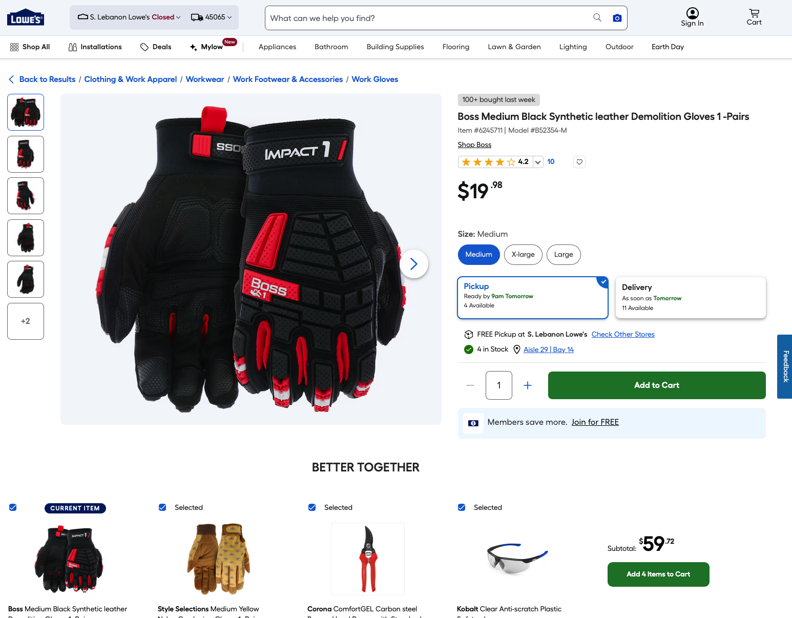
As the oldest glove company in the United States, Boss built a foundation of infrastructure, inventory, and partner relationships that allowed it to serve customers efficiently and effectively. With its deep history and reputation, Boss was positioned to become PIP’s premier power brand in the retail space — lined up for placement in major retailers like The Home Depot, Lowe’s, and Walmart.
But before that could happen, the brand needed a complete overhaul.
Understanding The Problem
A few years prior to the acquisition, Boss underwent a rebrand through an outside agency — and the result missed the mark entirely. Instead of honoring the brand’s rugged heritage, the redesign leaned heavily into fragmented category-specific colors, hyper-saturated palettes, and disjointed collateral filled with specs, cluttered layouts, and unrelatable photography taken in the previous company's parking lot.
It wasn’t just a visual issue — it was a credibility issue. Boss needed to stand confidently next to iconic retail brands like Milwaukee, Mechanix, and Craftsman. It had the name recognition and the history. What it lacked was a visual and verbal identity that matched its reputation.

My Role
I led the rebranding effort from the ground up. My responsibility was to guide a team of designers through every phase — from redefining the logo and brand color system to creating the foundational assets that would support a full-scale rollout across packaging, collateral, web, and retail environments.
That meant:
Auditing and modernizing every visual and verbal touchpoint.
Collaborating cross-functionally with product, marketing, and sales teams.
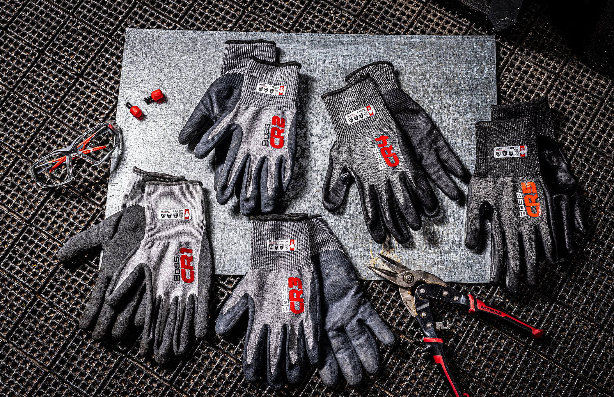
Leading the creative direction for lifestyle and product photography.
Creating a scalable system for future brand growth and consistency.
Boss had everything it needed — recognition, reach, and history. But without cohesion, those elements weren’t working together. My mission was to bring the oldest glove company in the U.S. forward a hundred years — and make it matter to today’s consumers.
The Process - Trust it
We started by getting out of the office.
With our marketing team, I conducted competitive store walks — studying brands on shelves, noting what stood out, what blended in, and where opportunities were being overlooked. Boss couldn’t just be another brand in red and black. It needed a distinct voice, a smart strategy, and a design system rooted in authenticity.
Next, we audited everything: packaging, hangtags, web pages, catalogs, signage, and existing product photography. We found massive inconsistency and dated visuals trying to carry a “modern” design language that simply didn’t reflect the people who actually used the products.
Then came the workshops — engaging internal teams to understand customer pain points, sales team struggles, and marketing needs. This wasn't about applying a fresh coat of paint. It was about designing a system that worked as hard as the people we were designing for.
I led the creation of mood boards, visual territories, logo and product name refinements, and packaging explorations. We established creative guardrails early and validated them along the way. This was about alignment — not just with internal stakeholders, but with end users.
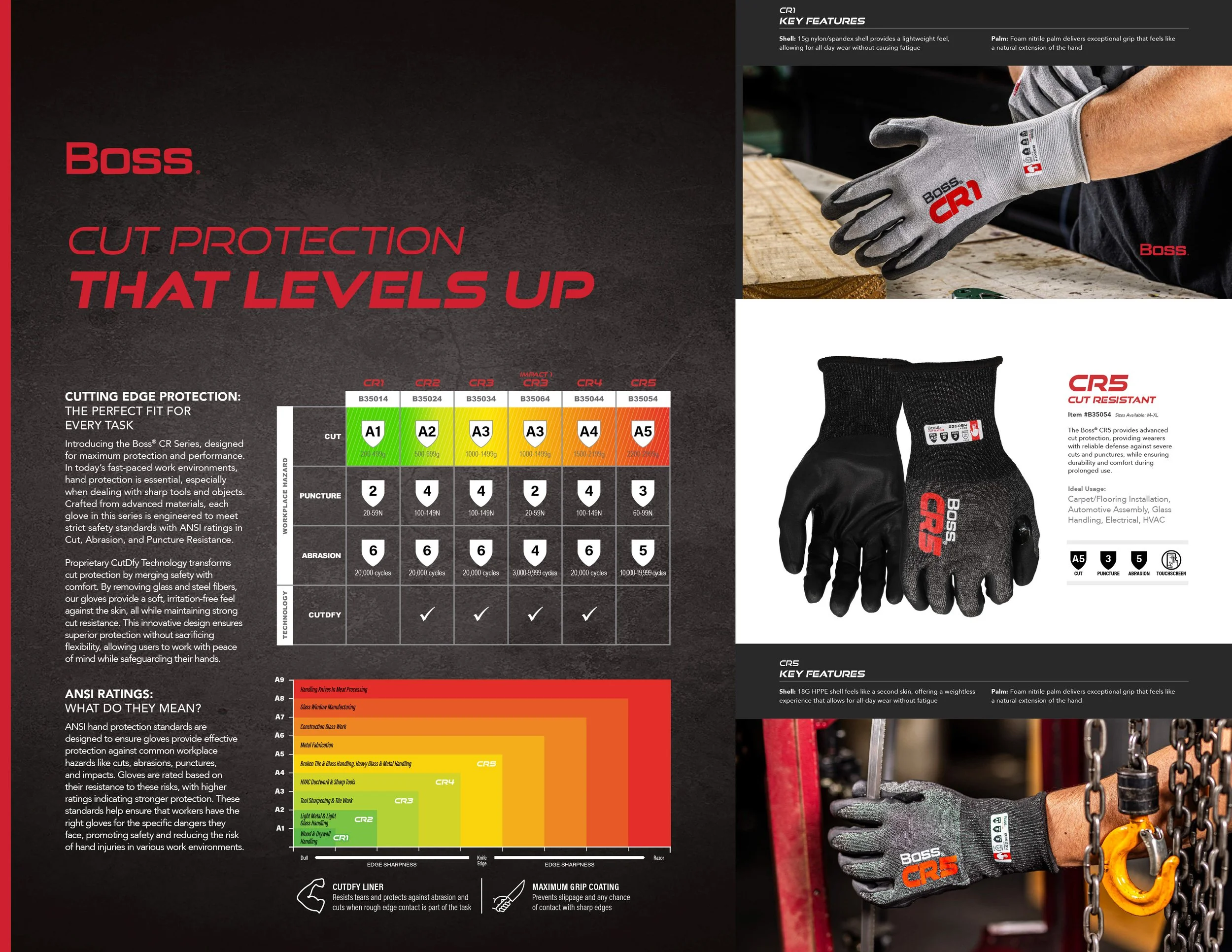
From photography to tone of voice to color strategy, every decision was made with purpose. We replaced artificial lifestyle shots with genuine on-the-job scenes. We scrapped category colors in favor of a unified yet flexible palette. We rebuilt Boss to be clear, confident, and consistent across all channels.
The Solution
We reimagined the Boss brand as something more than just a PPE company — we positioned it as a tool belt essential.
The new identity was rooted in heritage but designed for the modern aisle. The refined logo brought strength and stability, while the updated color system brought simplicity and structure without overwhelming the product offering.
We developed a custom iconography set, flexible layout templates, and a photography library showcasing real-world grit. The brand voice was shaped to sound like the people we serve — practical, hardworking, and no-nonsense.
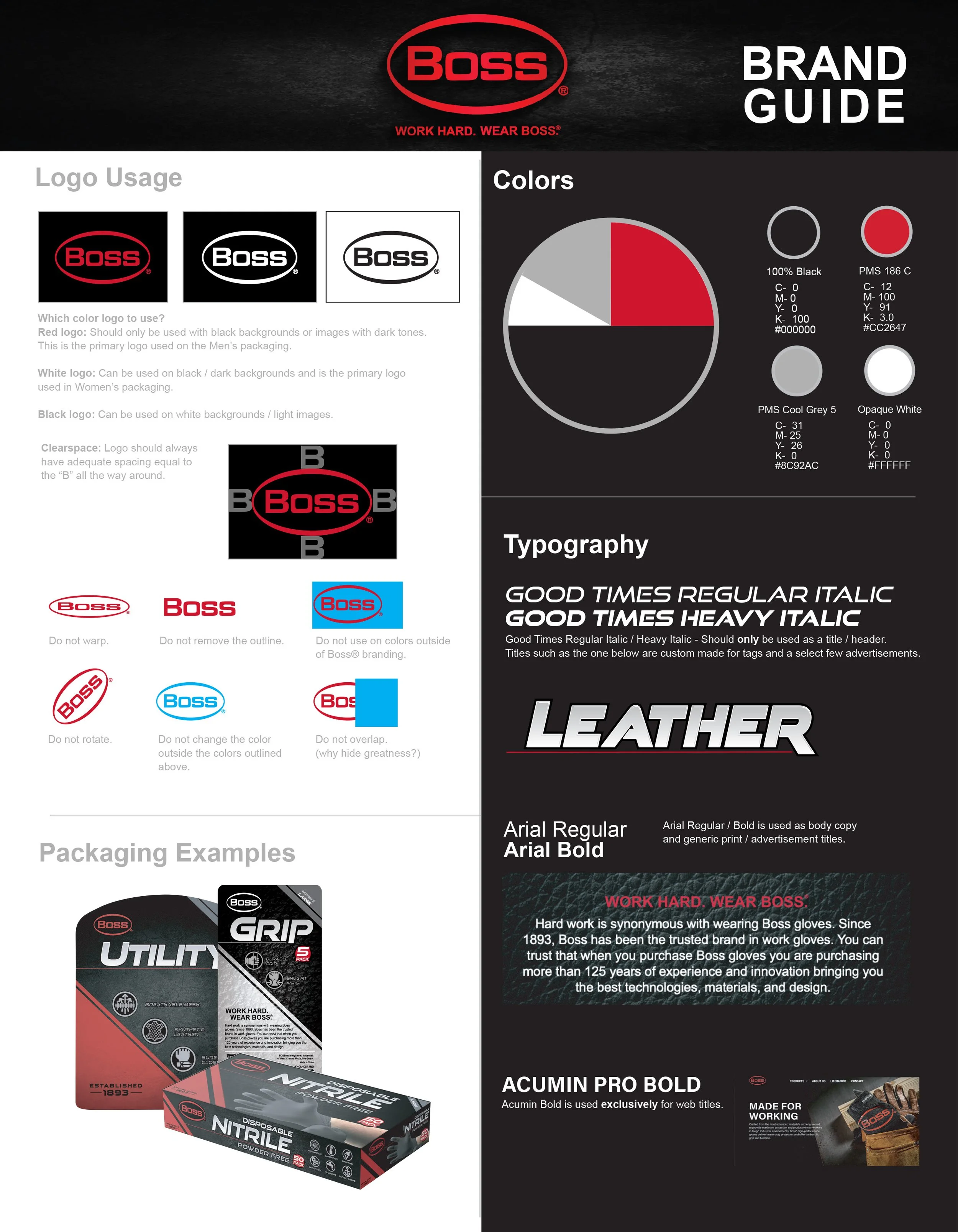
To ensure consistency, we created a full brand guide — detailing usage, tone, photography direction, type systems, and packaging rules. These tools allowed every department to speak the same visual language, whether designing glove packaging or building a retailer presentation.
The rebrand wasn’t just cosmetic. It was foundational.


